

Poster Design for School Competitions: Layout, Lettering and Colour

A strong poster gets its message across in a few seconds, even from across a school hall. Good school poster design comes down to three things: a clear layout, lettering people can read and colours that work together. This Haanz Art Guide explains each step simply, with a plan you can follow for poster competitions on themes like road safety, dengue prevention, saving water or protecting forests.
What you need
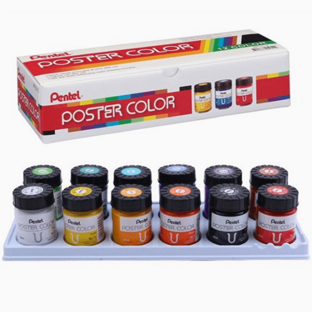
- Paint: Pentel Poster Colours 12x30ml are opaque with a smooth matt finish, so colours stay flat and bright. For large areas, Banner & Poster Paint – 100ml comes in bigger 100ml packs.
- Paper: a large sheet of Poster Paper gives you plenty of room for charts and posters. Always check the size your competition asks for.
- Markers for lettering: the Uni-posca 8 pen set -(PC-5M) has opaque paint markers with a medium bullet tip for neat letters. A Uni-Posca (PC-8K) -Black has a broad 8mm chisel tip for bold headings and outlines.
- Design markers: Touch Dual Tip Art Marker 12 Pack have broad and fine tips for quick colour roughs.
- Basics: a Graphite Drawing Pencil in HB or 2B for light planning lines, a soft Mont Marte Artist Eraser – Small and the Bomeijia Brush set 6Pcs for filling shapes.
- A long ruler, a cloth, a water pot and a mixing palette.
See all colours in Poster Paints & Tempera and marker sets in Art Markers Sets. Prices change, so see each product page for today’s price.
Plan your layout before you paint
- Write the message in a few words. A poster is not an essay. Aim for a short slogan of three to seven words, plus maybe one smaller line.
- Choose one main image. One large mosquito, one tap with a single drop or one tree is stronger than many small pictures.
- Make thumbnails. Draw three tiny versions. Try the slogan at the top, at the bottom and across the middle. Pick the clearest.
- Use a simple grid. Divide the paper into thirds with light pencil lines. Place the main image and the heading on these lines for a balanced look.
- Leave breathing space. Keep a clear margin around the edges and some empty space around the words.
Lettering that is easy to read
- Draw guide lines. Use a ruler to draw two light lines for the height of your letters. This keeps every letter the same size.
- Use simple, bold letters. Thick block capitals are easiest to read from far away. Save fancy styles for one small word, if any.
- Space letters evenly. Sketch the whole word lightly first, then adjust before you paint or ink.
- Fill, then outline. Paint the letters with poster colour, let them dry, then outline with a dark paint marker for a sharp edge.
- Check from a distance. Prop the poster up and step back a few metres. If you cannot read it easily, make the letters bigger or bolder.
For more lettering practice, see Hand Lettering for Beginners and Art Markers and POSCA Guide.
Colour tips for school poster design
- Use strong contrast. Dark letters on a light background, or light on dark. Yellow on white or red on green is hard to read.
- Limit your palette. Three or four main colours look planned and confident.
- Match colour to mood. Red and orange feel urgent, which suits safety posters. Greens and blues feel calm, which suits nature themes.
- Paint flat areas. Mix enough paint for each large area before you start, so the colour stays even.
- Work in the right order. Paint the background first, then the main image, then the letters, and finish with outlines.
Common mistakes to avoid
- Too much text, which makes the poster look like a page from a book.
- Letters that get smaller towards the end of the word because there was no planning.
- Watery paint that streaks and makes the paper wrinkle in humid weather.
- Placing the slogan too close to the edge of the paper.
- Forgetting your name label or putting it on the front when the rules say the back.
Need help choosing paper? Read Paper for School Projects and Posters.
Frequently asked questions
Is poster colour or acrylic better for a school poster?
Poster colour is the usual choice. It is opaque, dries to a flat matt finish and is easy to wash from brushes with water. Acrylic is fine too, but it dries fast and is harder to clean off brushes once dry.
How do I keep my poster letters straight?
Draw two light pencil guide lines with a ruler for each line of text, sketch the letters lightly, then paint. Rub out the pencil lines gently once the paint is fully dry.
Do you deliver islandwide?
Yes. We deliver across Sri Lanka in 2–5 working days, with cash on delivery, card or bank transfer. You can also visit our shops in Boralesgamuwa and Horana, open every day from 9 AM to 6 PM.
Not sure what to choose? Call / WhatsApp the Haanz team on 0711 515 515 and we’ll help you pick paints and markers for your poster.
More Haanz Art Guides
 Mont Marte Acrylic Paints: Tube Sizes and Sets ExplainedRead the guide →
 Art Classroom Supply List for TeachersRead the guide →
 Art Supplies for O/L and A/L Art: A Student ChecklistRead the guide →
 Calligraphy for Beginners: Dip Pens, Nibs, Ink and PaperRead the guide →
